

BRIEF
01
Produce branding for a new Welding Engineering company
Stellar Welding was a startup that needed branding to establish a visual identity and solidify its presence. When they came to us for branding, they were looking for a letterform logo which was strong, unique and easily identifiable. Stellar wanted a logo that could be isolated and feature on a variety of different mediums, including a range of safety workwear.
SOLUTION
02
We started by looking at competitors in the market, and the approach they took to branding, along with the basic fundamentals of the trade. Once the initial research was complete, we began to create a variety of concepts focusing on the 'S' of the company's namesake. We tried to keep in mind the theme of elements 'coming together' to represent welding, and shy away from the more obvious visual representations.
After a few rounds of amendments, we reached the final design, which draws inspiration from the visual of an AC Waveform, and features two elements locking together to form the 'S' character.
RESULT
03
The result conveys a strong, modern and clean piece of branding, that can be used in a variety of different mediums, along with stationery, a website and workwear, always keeping within the specific brand guidelines we created.
We started by creating several initial concepts which were sent to the client for feedback.
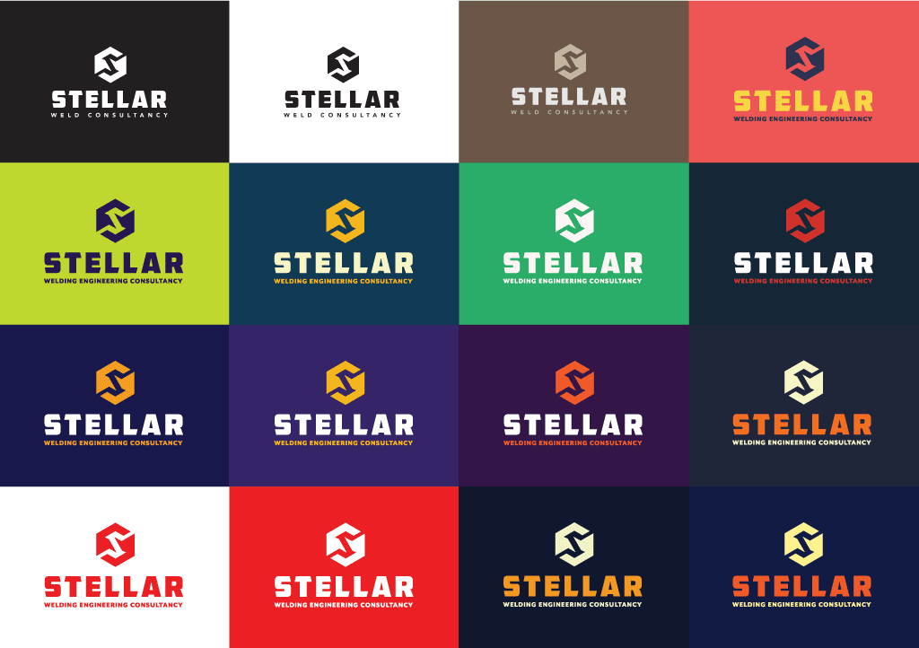
With a preferred logo established, we then provided the client with a variety of colour combinations.

The final result, incorporating the preferred colours, font and logo.

When it came to website creation, we kept the design clean, minimalist and easy to navigate.

A sample of some of the other mediums we created alongside the initial branding.
FONT
04

GLYPH

CHARACTERS

COLOUR PALETTE
05
HEX
RGB
CMYK
PANTONE
#F3B51B
243, 181, 27
4%, 31%, 100%, 0%
1235 C
#F9F6C1
249, 246, 193
3%, 0%, 31%, 0%
7499 C
#113B54
17, 59, 84
96%, 73%, 44%, 36%
7694 C
Paul at Passenger 8 came highly recommended. I started my business with a tight startup schedule and ongoing projects. Passenger 8 produced some excellent branding, managing the whole process and exceeding my delivery expectations. I can't recommend enough.
RUSSELL PHIPPS
STELLAR WELDING ENGINEERING CONSULTANCY

Explore similar work


